Where to find us
Aarhus
Filmbyen 23
8000 Aarhus C
All Sides of One Brand
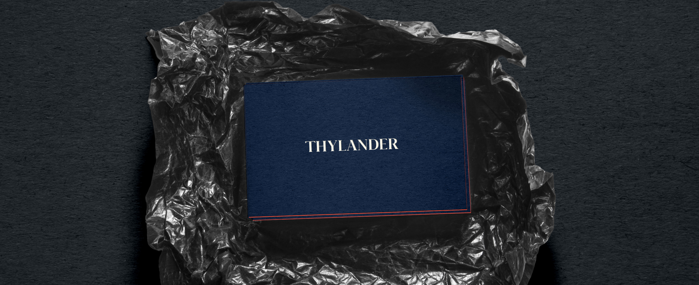
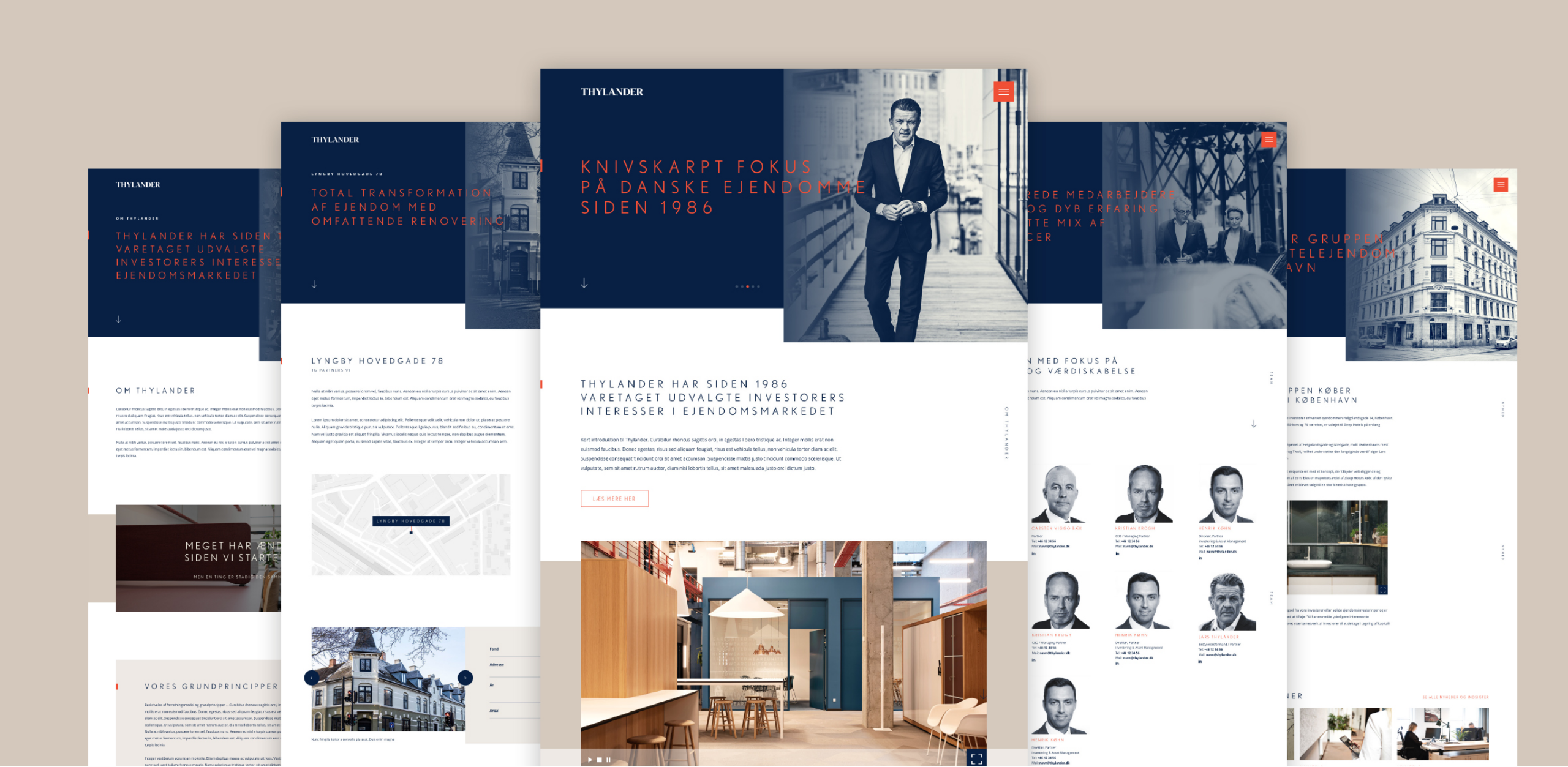
Thylander needed to reappraise its entire brand profile and communication platform. To solve the challenge, we created one unifying narrative and design language to capture the contrasting facets of Thylander’s identity. The result was an unique identity, a razor-sharp brand manifesto and the cornerstone of Thylander’s new visual universe – the logotype.
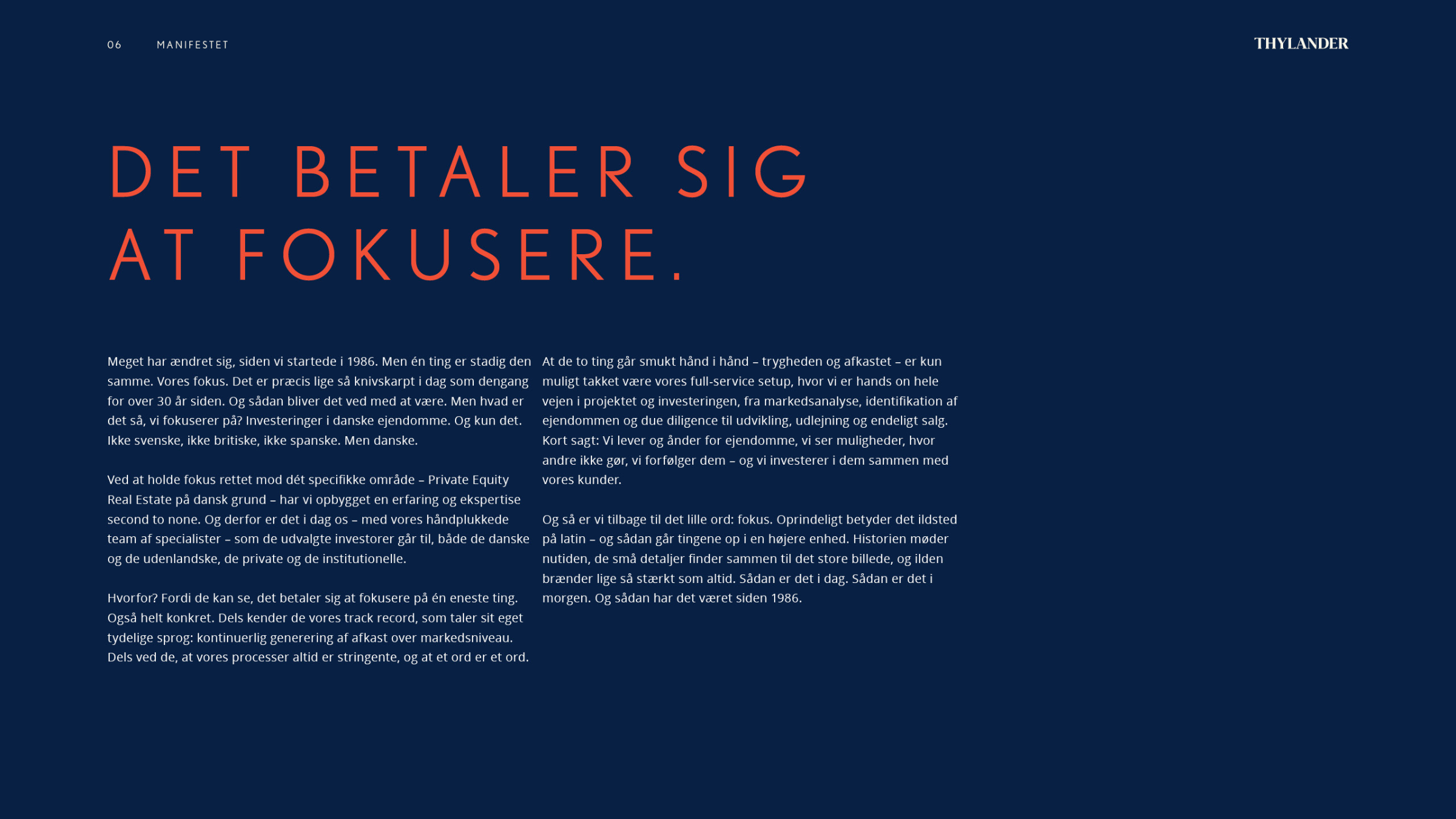
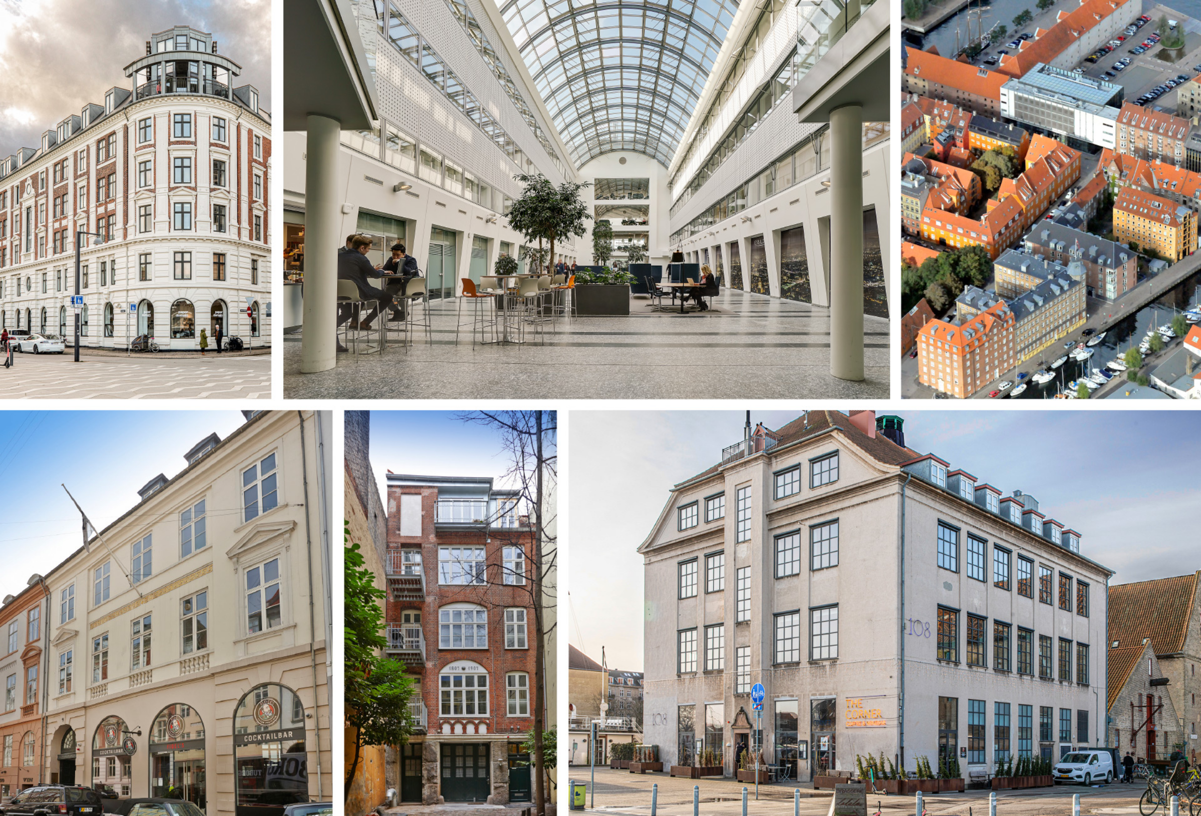
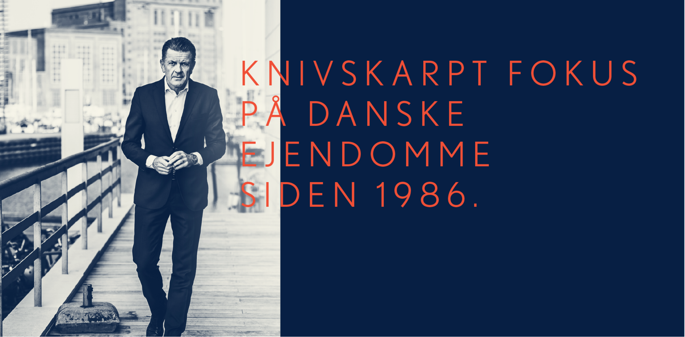
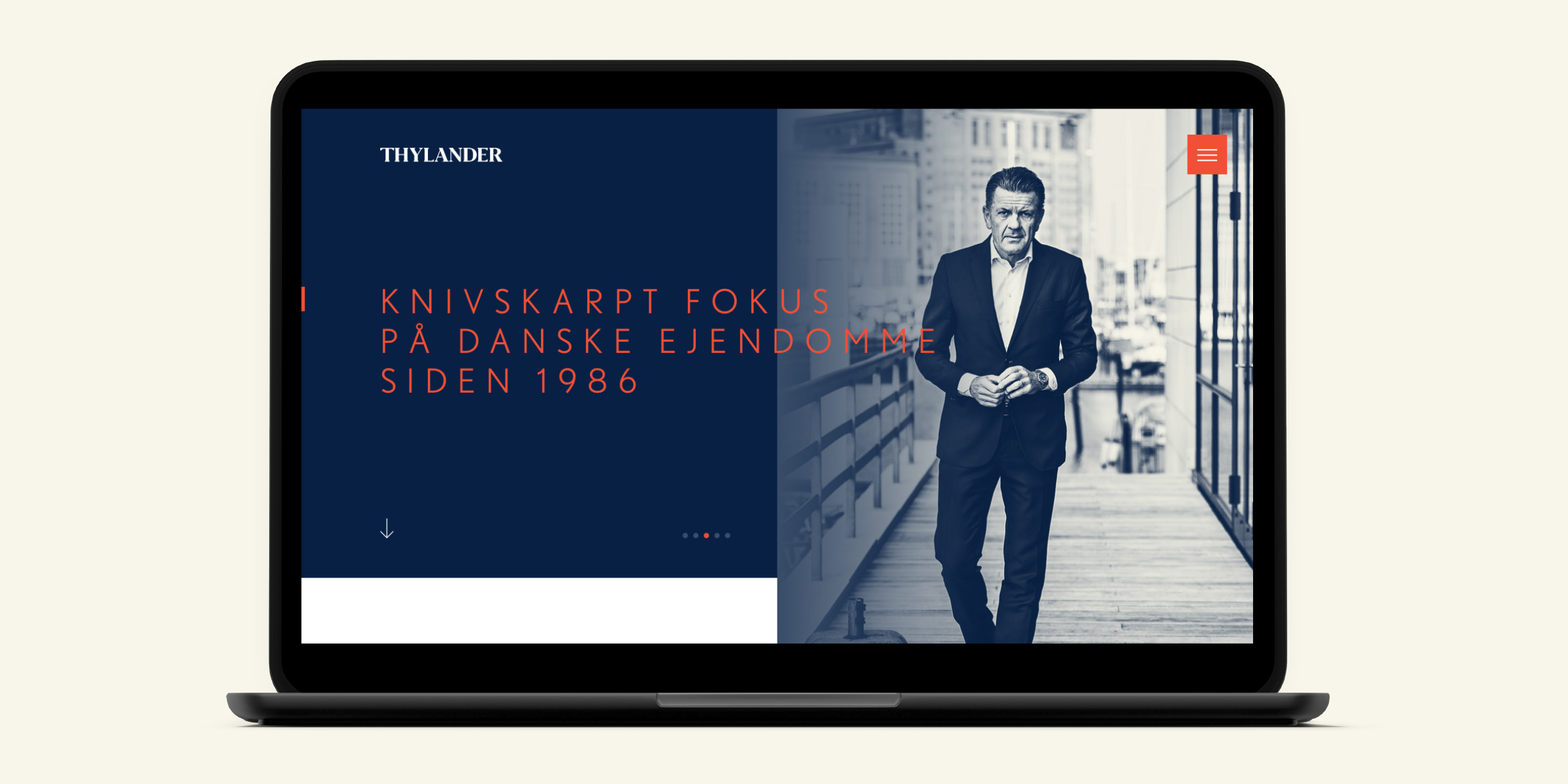
With its strong track record historically amongst Danish investors, Thylander wanted to create a stronger profile to both attract international clients and capitalize further on its domestic status as the go-to firm within private equity real estate. The analysis revealed that the essence of Thylander was its “razor sharp” focus on Danish private equity real estate since its establishment in 1986. By accumulating decades of experience in the category and treading its own path, Thylander has been able to offer its clientele the foresight necessary to make the investments of tomorrow, today. With both tradition and foresight at its core, the challenge was to encapsulate Thylander’s duality into a distinct brand narrative and visual expression.
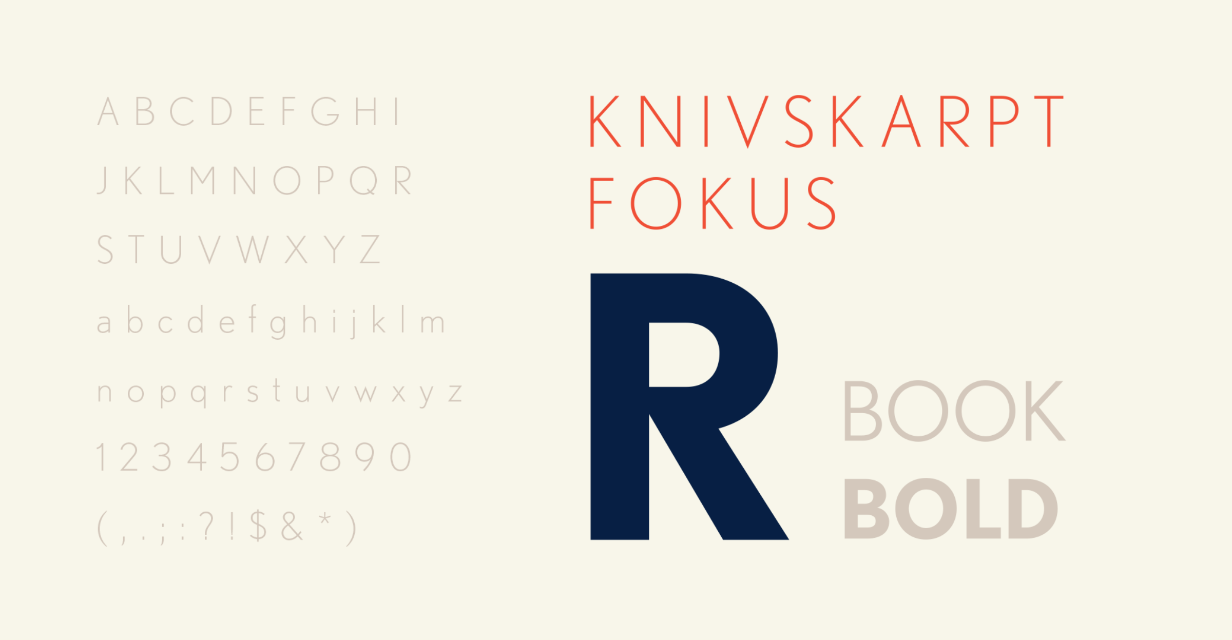
To solve Thylander’s challenge, the team at Sunrise had to create one unifying narrative and design language to capture the contrasting facets of Thylander’s identity. Recognizing its achievements of the last 30 years began with writing a brand manifesto which laid out the longevity of Thylander’s unique ability to focus, culminating in the line “Razor sharp focus on Danish real estate since 1986”. This razor-sharp focus stems from both Thylander’s experience and its ability to see new opportunities where others do not. Visually the duality of drawing upon experience was manifested in the blue notes of the design, while the foresight of new opportunities shown in red accents.
The result was a strong brand manifesto and a new corporate visual identity of Thylander that expresses professionalism and expertise, while also paying homage to Thylander’s Danish roots, heritage and the distinct value that they offer to the private equity real estate market.
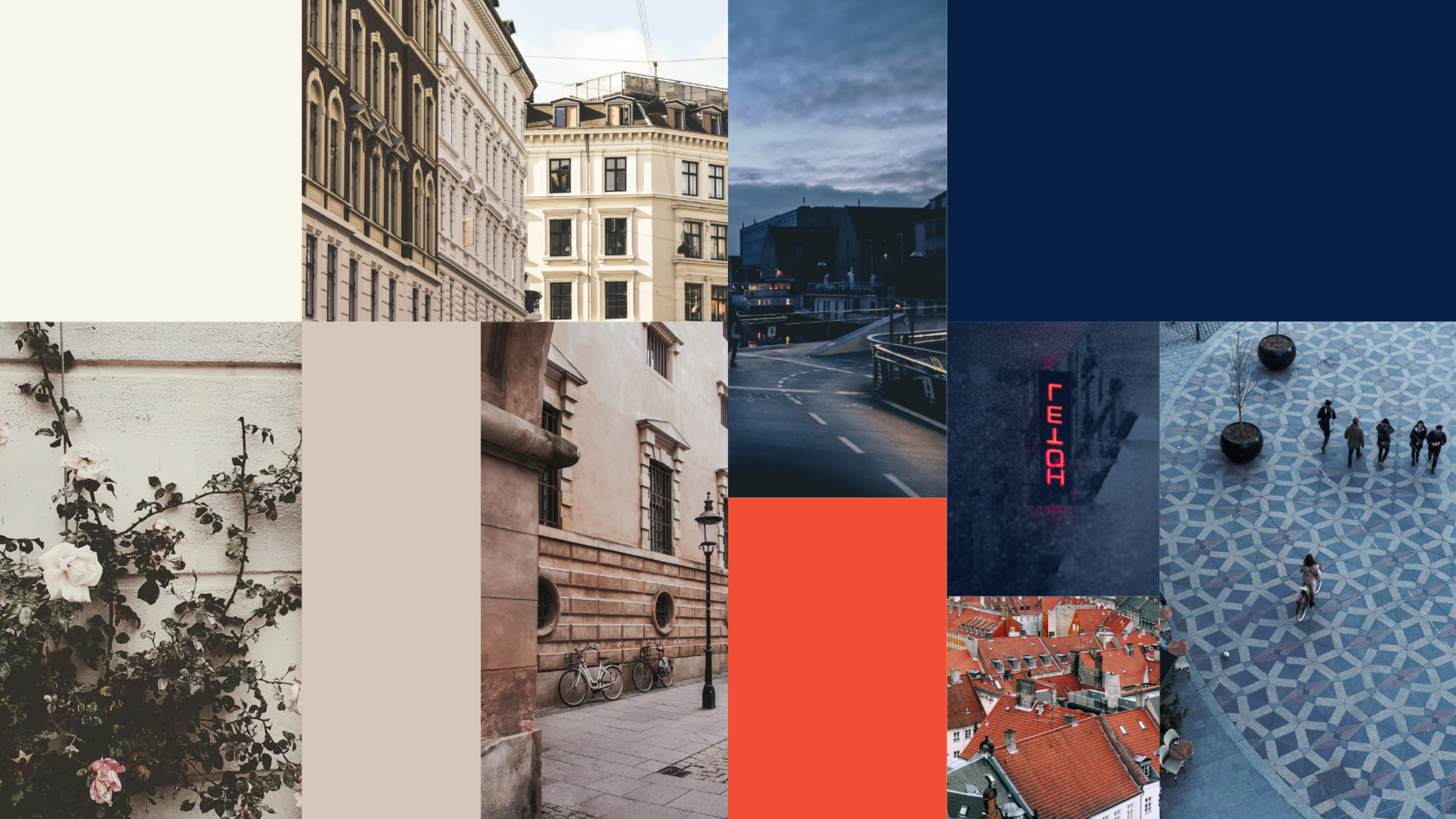
Both the colours and typography are inspired by the architecture in the city centre and the classic Copenhagen signage with its minimalist, clean lines and modernist references.
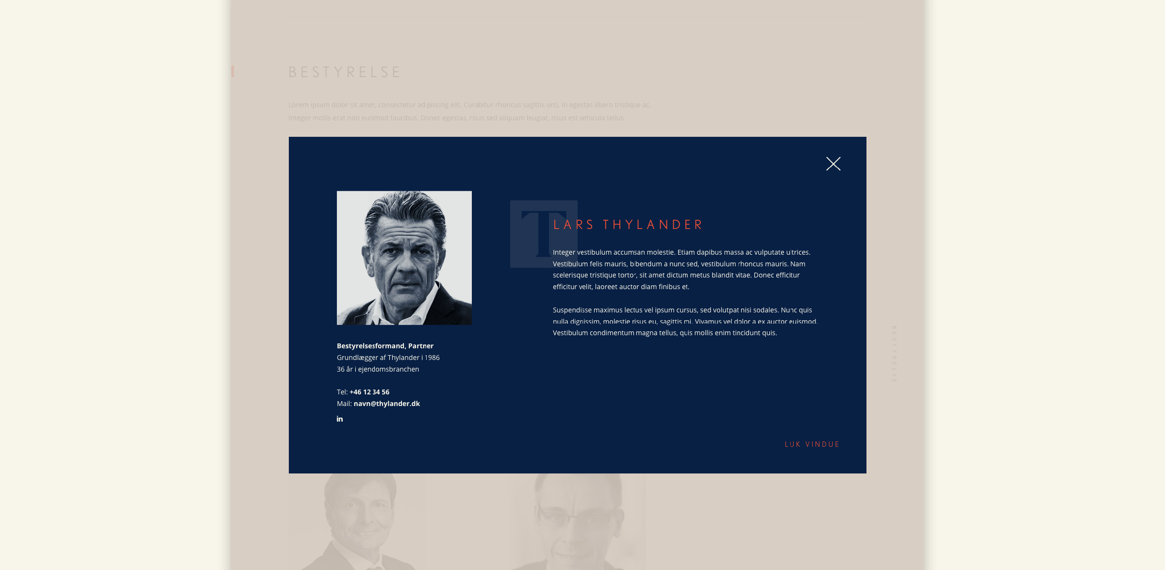
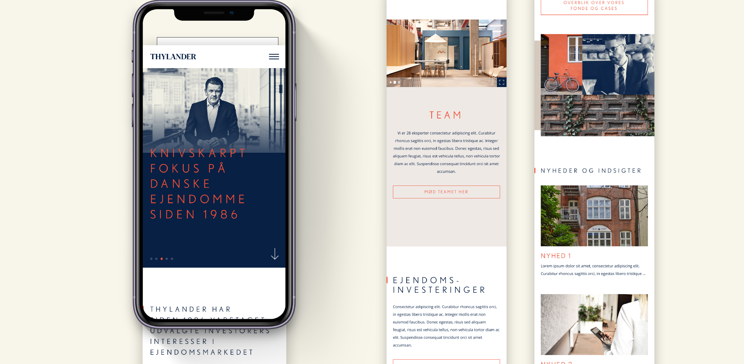
A new picture style for Thylander was also defined. Portraits are professional while also conveying personality, authenticity and narrative. Furthermore, a characteristic overlay creates a distinct visual expression that helps Thylander stand out from the competition.
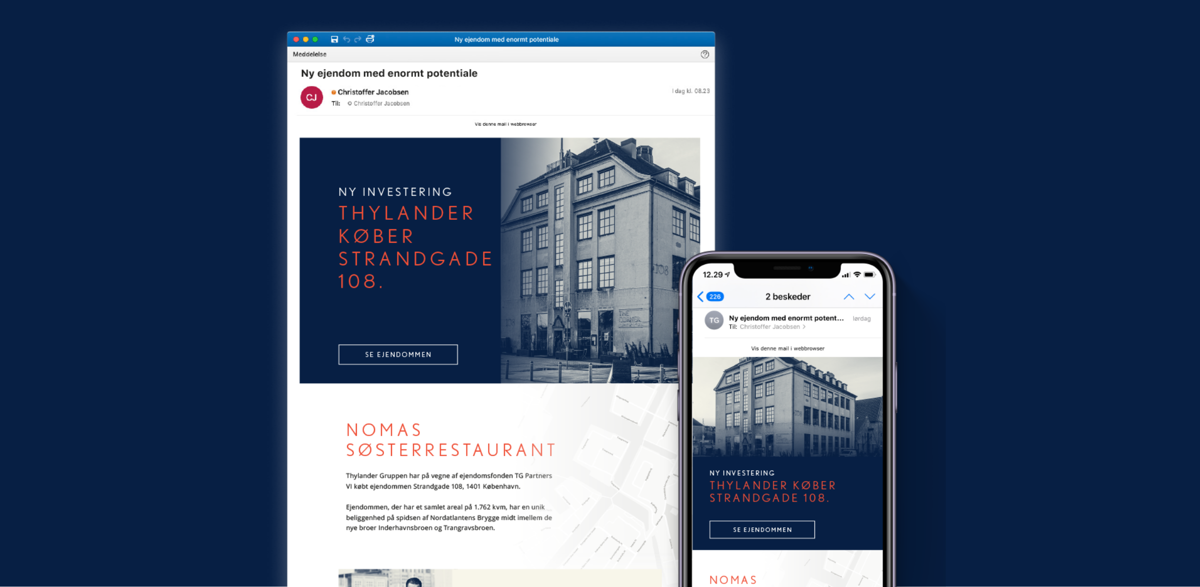
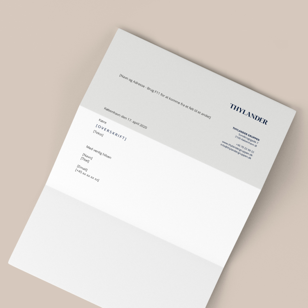
The cornerstone of Thylander’s new visual universe is the logotype with its solid, bold expression and accompanying insignia, to be used throughout communication elements. The new brand has also been rolled out in a sales presentation – a vital touchpoint for the acquisition of new clients. Finally, a new website places the brand platform and visual identity into a digital context.
With the new brand platform, we have succeeded in clearly and effectively getting across who we are and how we create value for our investors. It’s spot on for the way we want to be seen in the market.
The brand platform is a true reflection of our 34 years of experience and the array of knowledge and foresight needed to succeed in this business. We have always focused on the Danish private equity real estate market with pride and precision, and this new brand platform captures the story we’ve always lived and are now encouraged to share further
Lars Thylander, Partner and Chairman of the Board, Thylander