Revamping P+’s visual identity for modern appeal
One of Denmark’s largest pension companies, P+ offers intelligent pension schemes and flexible insurance policies tailormade for academics. While its services are undoubtedly strong, the company’s visual identity did not fully capture its performance, nor connect with its modern and reflective target audience. To address this, we set out to refresh P+’s visual identity by introducing a more contemporary and dynamic feel.
Challenge
The challenge was to translate P+’s existing identity into a more modern and dynamic expression, while also aligning it with current trends and the demands of digital platforms. Continuous development of the visual identity was essential to meet the evolving expectations of the company’s members and stay relevant in changing times.
Solution
We began by delving into the essence of P+ as the pension fund for academics. Its target audience, which includes lawyers, economists and engineers, embodies modernity, curiosity, and a thirst for knowledge. Our approach aimed to resonate with these qualities through an updated identity that embraces modernity and dynamism. The solution retained the essence of P+’s existing identity but introduced contemporary elements – therefore ensuring adaptability across digital platforms and alignment with current trends.
Result
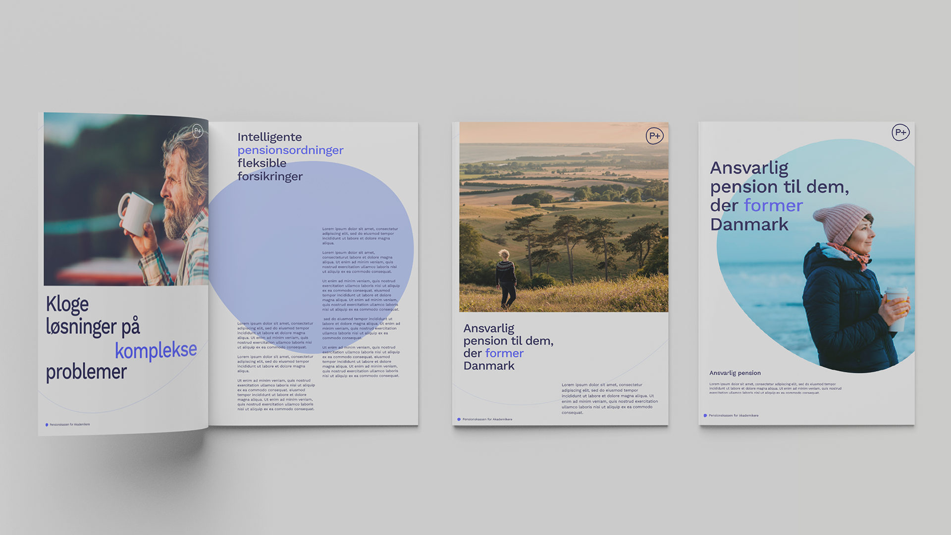
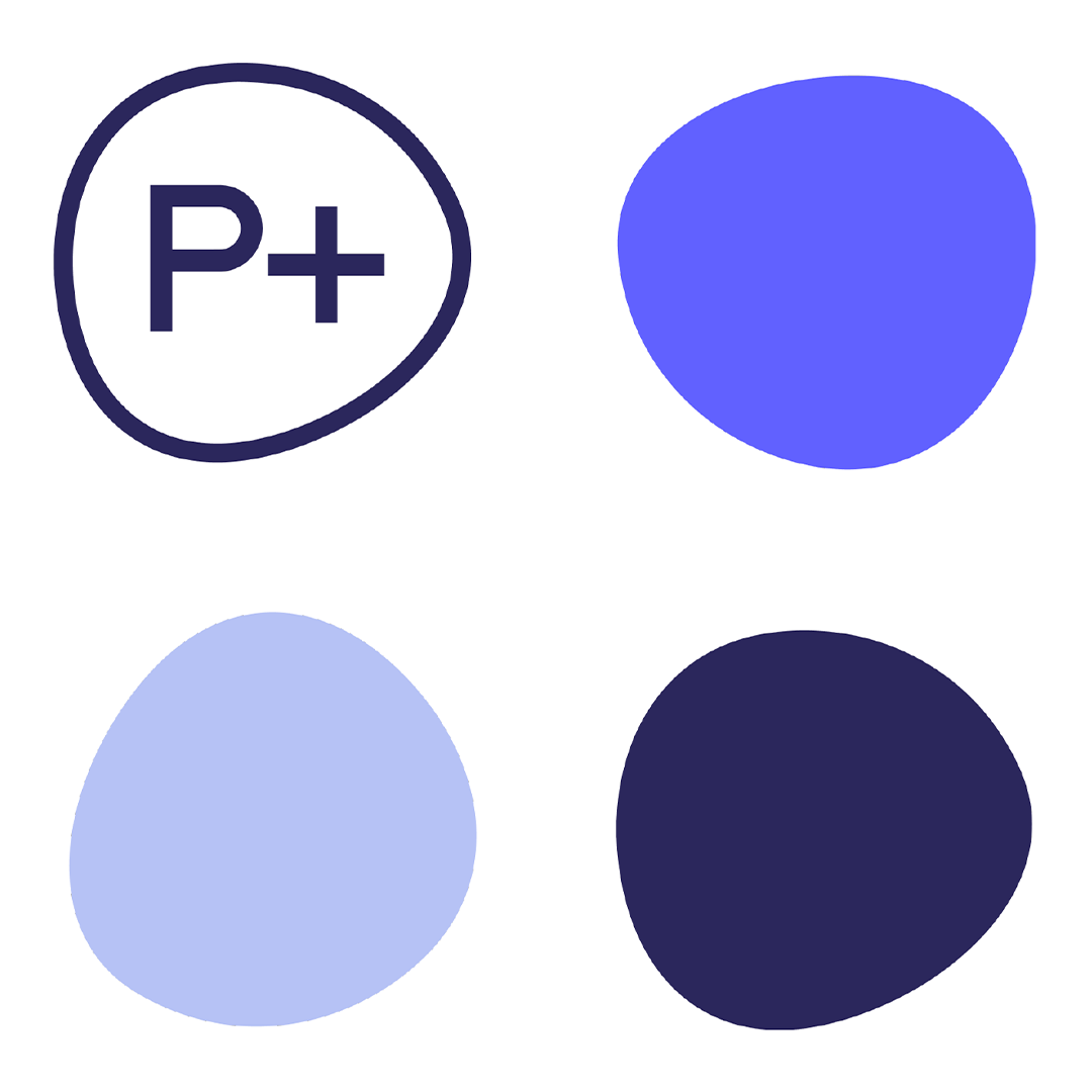
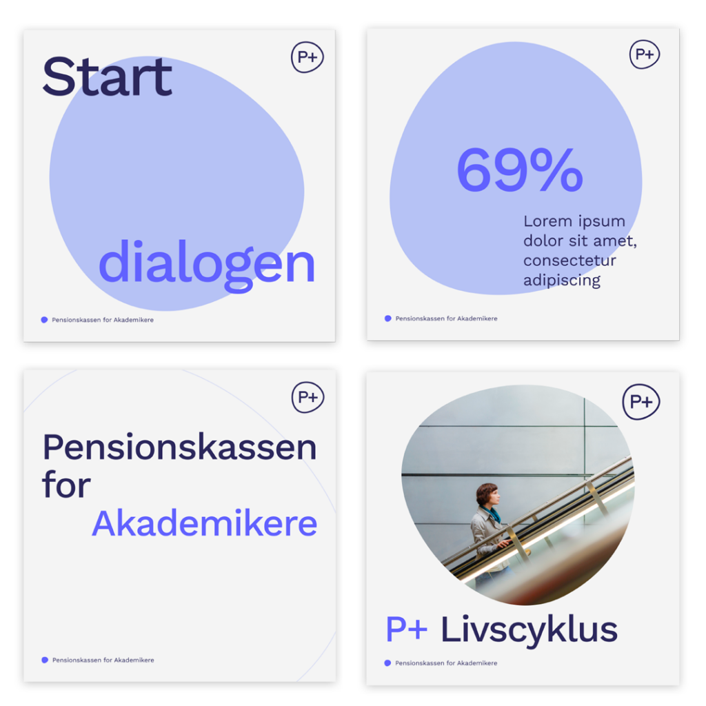
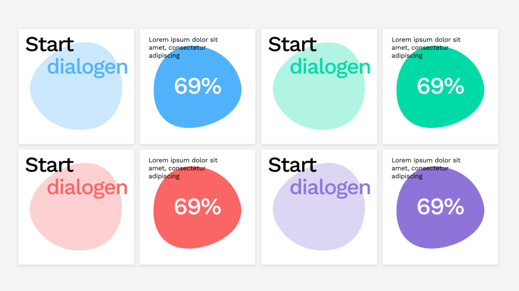
The circle in P+’s existing logo, which symbolises flexibility and life, became the central element in the updated visual identity. This element was seamlessly integrated across various facets, including social media and print materials.
While we chose to preserve P+’s primary colours for brand recognition, we introduced vibrant secondary colours to infuse a modern outlook and set P+ apart from other pension companies. These changes contributed to a nuanced and synchronised expression, aligning closely with the company’s core narrative and resonating with its members.
The solution extended to developing design guidelines that include graphics, colours, and image styles. We also crafted templates for social media to give P+ the ability to easily maintain its visual identity in daily operations. Internal elements such as report covers, LinkedIn banners and PowerPoint templates were also updated in connection with the new identity. Bringing new vitality into P+, the revamped visual identity has helped ensure the company can maintain its standing as a symbol of trustworthiness and modernity for its valued members.