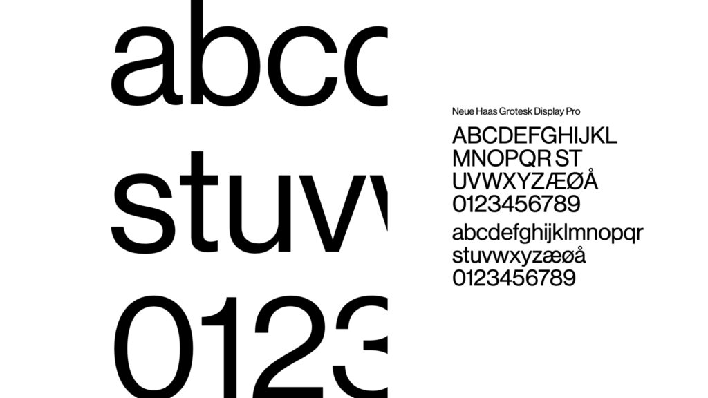
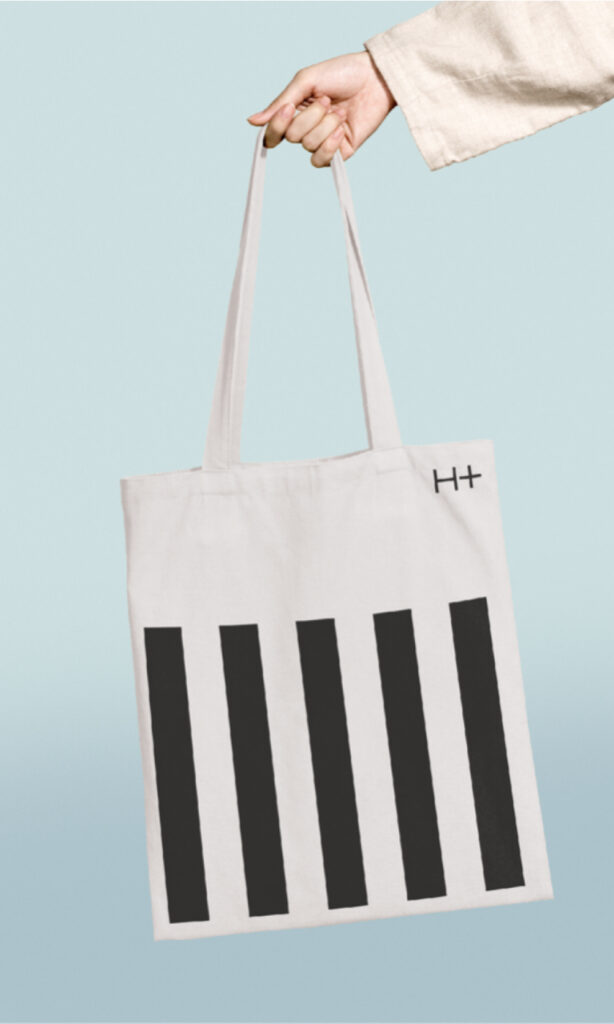
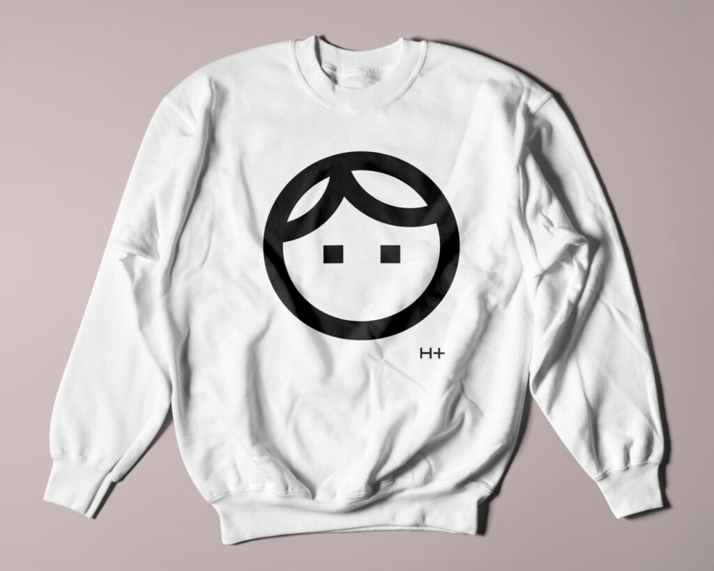
5 lines to tell every story
Founded in 1947, H+ has expanded in the past few years to become one of the country’s fastest growing architecture firms. With more than 100 employees working in Copenhagen, Aarhus, Odense and Nakskov, the company solves a vast array of assignments for important clients. However, the visual identity needed a major upgrade, so H+ reached out to Sunrise.
Challenge
The company has many business units: architectural consultancy, general consultancy, cultural heritage, interior design, construction management, facilities management and client consultancy. The main question: how to develop one graphic expression that accommodates all these different business units?
Solution
The name H+ is sharp and simple, but there is much more to it than meets the eye. H+ is more than just architecture. H+ is 360-degree advice for ambitious professional builders. The philosophy is encapsulated in the short name. As CEO Rasmus Klausen said: “We must make what seems like opposites merge into a higher unity. We unite science and passion, form and function, economy and aesthetics, reason and emotions, bricks and people. It is this duality that our “+” stands for, so that we are constantly reminded of our task”.
Our solution was simple and could accommodate all the complexities of the brand. The name “H+” consists of just 5 lines, but based on these alone, we can tell all the stories that the company wants to share. Singular, functional, creative: exactly like H+.
Result
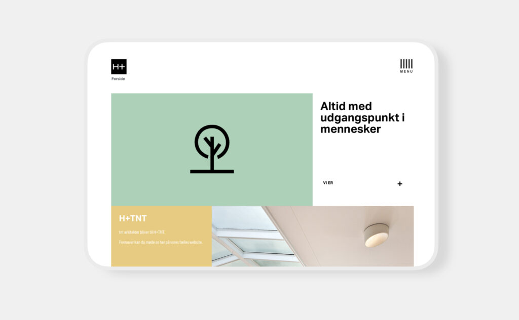
A unique graphic design that can be used across all media and can effectively communicate all the stories of H+ to the world.